The Design Mistakes I See in Almost Every Home
From single-source lighting to furniture pushed against every wall, these are the interior design mistakes that quietly stop a home from feeling as good as it could and the simple shifts that make all the difference.
I walk into a lot of homes. It’s one of the privileges of my job seeing how people live,how they’ve interpreted their spaces, what’s working and what isn’t. And while every home is different, certain mistakes come up so often that I could almost set my watch by them. These aren’t catastrophic errors. They’re not houses falling down or rooms painted entirely the wrong colour. They’re subtler than that the kind of choices that quietly prevent a home from feeling as good as it could. And the frustrating thing is, most of them are entirely fixable.
This isn’t about making anyone feel bad about their home. It’s about sharing what I’ve learned from years of designing interiors professionally, in the hope that even one of these observations makes you look at your own space a little differently.
Lighting that does one job
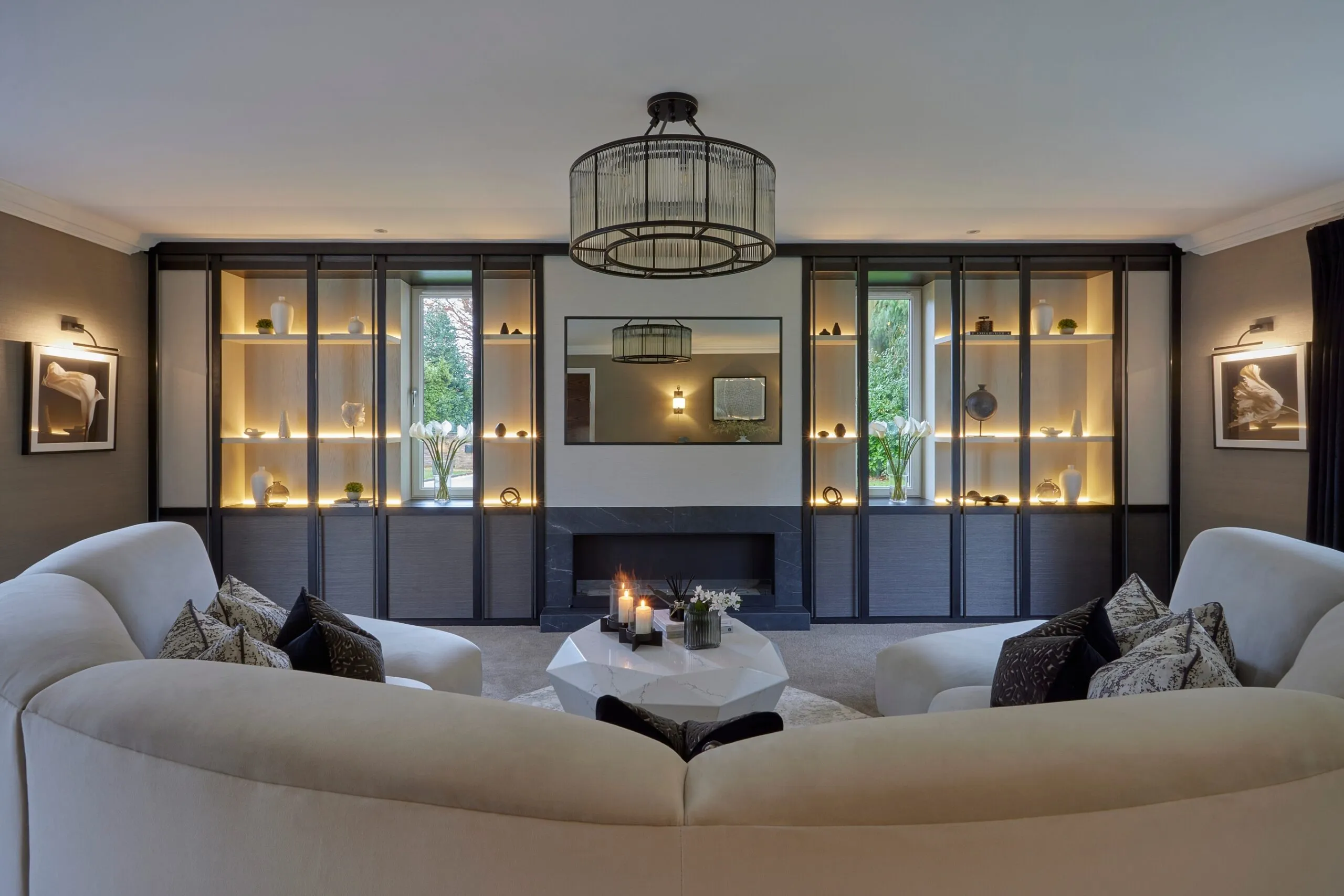
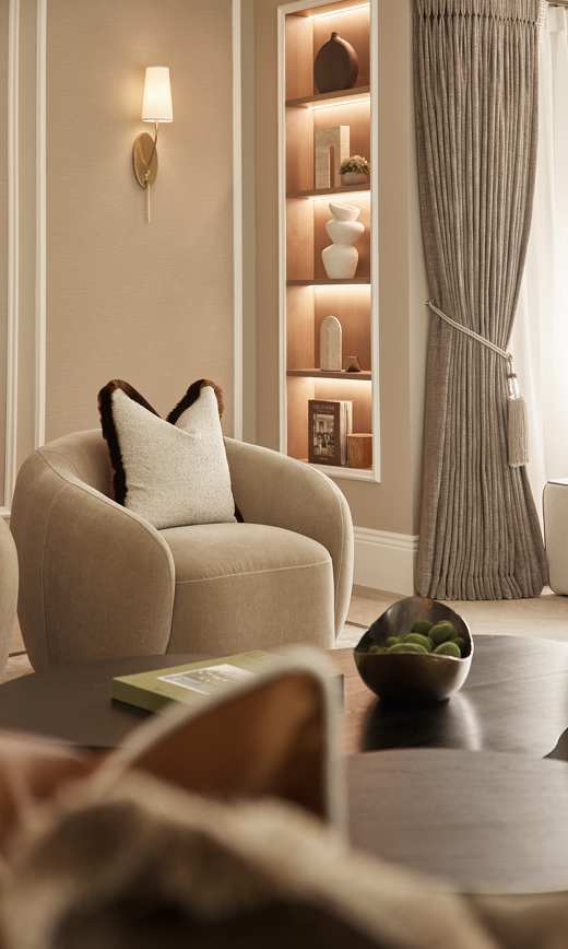
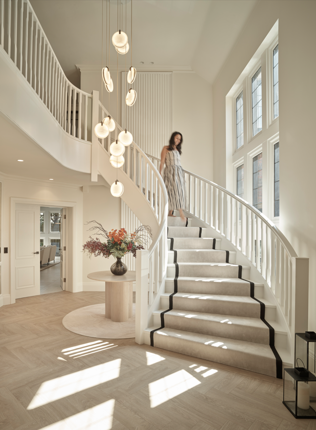
I start with this one because it is, without question, the single most transformative thing you can change in a room and the thing that almost everyone gets wrong. The standard approach to lighting is a single pendant in the centre of the ceiling.It’s how most homes are wired, it’s what most people inherit when they move in,and it’s the reason so many rooms feel flat, clinical or vaguely uninviting once the sun goes down.
A well-lit room uses layers. A pair of table lamps on a console. A floor lamp beside a reading chair. Subtle down lighters washing a wall with warmth. A pendant that provides atmosphere rather than floodlighting everything to the same flat intensity. The goal is to create pools of light areas of warmth and shadow that give a room depth and mood. When I design a lighting scheme, I’m thinking about how the room will feel at nine o’clock on a Tuesday evening, not how it looks at midday. That’s when lighting really earns its keep.
The good news is that this is one of the easiest design mistakes to fix. You don’t need to rewire anything. A couple of well-placed lamps and a dimmer switch on your overhead light will change the entire character of a room overnight.
Furniture pushed against every wall
I understand the instinct. You want the room to feel as spacious as possible, so you push the sofa against one wall, the armchairs against another, and leave a vast,empty expanse of floor in the middle. It feels logical. But it almost always has the opposite effect to the one you’re hoping for.
A room where all the furniture clings to the walls feels like a waiting room. There’s no intimacy, no sense of a space within a space. Pulling your sofa even thirty centimetres away from the wall letting it float, creating a walkway behind it, anchoring it with a rug immediately makes a room feel more deliberate,more designed. It creates zones: a seating area, a reading corner, a route through the room that feels natural rather than forced.
I know this feels counter intuitive, especially in smaller rooms. But I’ve used this approach in everything from compact terraced houses to large open-plan living spaces, and it works every time. The trick is giving the room a centre of gravity a point that the furniture gathers around rather than treating the walls as the only place things can go.
Kitchens designed for the photograph, not the cook
This one is close to my heart because I see it so often in new builds and renovated homes.A beautiful island, a stunning worktop, gleaming handles and a layout that makes actually cooking dinner a frustrating experience.
The most common version of this is an island that’s been added because it looks impressive, without enough clearance around it for two people to move comfortably. Or a hob positioned on the island with no thought for where steam and cooking smells travel. Or a sink placed so far from the dishwasher that loading it becomes a minor workout. These are layout decisions that look perfectly fine on a plan but reveal themselves the moment you try to make a meal for four on a Friday evening.
A kitchen should be designed from the inside out starting with how you actually cook,how many people use the space at once, where the bins need to go, where you put the shopping bags when you walk in the door. The finishes come last. I’d take a brilliantly laid-out kitchen with simple, honest materials over a poorly planned one in the most beautiful stone any day.
No plan for where life actually happens
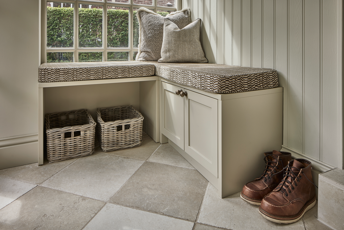
This is the one that separates a designed home from a decorated one. It’s all very well having a beautiful hallway with a statement console and a carefully chosen mirror. But if there’s nowhere to put the post, hang a coat, drop a set of keys or tuck away a pair of shoes, that hallway will look like a bombsite within forty-eight hours of anyone actually living there.
Real life is messy. Children come home with bags and lunchboxes and PE kits. Deliveries arrive. Coats accumulate. Chargers, glasses, books everything needs somewhere to go. And if your design doesn’t account for that, the clutter doesn’t disappear. It just piles up on the nearest surface and slowly unravels the room around it.
When I design a home, some of the most important decisions are the least glamorous ones.Where the shoe storage goes by the back door. Whether there’s a drawer in the kitchen island for phone chargers and takeaway menus. Whether the utility room has a counter top for folding laundry. These aren’t exciting design moments, but they’re the reason some homes stay looking beautiful and others don’t.
Choosing finishes in isolation
Here’s something I watch people do all the time, and it almost never ends well. They choose a floor tile in a showroom under fluorescent lighting. They pick a paint colour from a fan deck at the kitchen table. They order a fabric sample and hold it up against the window. And then they’re surprised when all three arrive and feel like they belong in completely different houses.
Materials have to be chosen together, in context. A warm-toned tile changes character completely against a cool grey wall. A fabric that looks subtle on its own can feel overwhelming next to a busy stone worktop. Colours shift depending on the light they’re seen in a north-facing room will make the same shade look entirely different from a south-facing one.
This is one of the reasons I always bring large samples of everything to a client’s home and lay them out together, in the actual room, at different times of day. It takes longer than choosing things from a screen, but it’s the only way to be sure that the finished result feels cohesive rather than assembled from different mood boards.
Treating the house as a collection of separate rooms
This is particularly common in phased renovations, where the kitchen is done one year,the living room the next, and each room ends up with its own distinct personality. Individually they might each look fine. But walk from one to the other and there’s no thread no sense that the same home, the same sensibility, runs through the whole house.
A well-designed home has continuity. That doesn’t mean every room looks the same far from it. But there’s a consistent palette, a shared material language, a sense that the hallway, the kitchen, the living room and the bedroom all belong to the same story. It might be as simple as a timber tone that carries through the joinery, or a wall colour that shifts in intensity from room to room but stays within the same family.
This is one of the hardest things to achieve without a designer, because it requires you to think about the whole house at once rather than room by room. And it’s one of the things our clients notice most when they live in the finished result that feeling of coherence, of everything belonging together, even though every room has its own character.
Getting scale wrong
Of all the interior design mistakes on this list, this is the one that’s hardest to fix once it’s happened because it usually involves furniture. The dining table that’s too small for the room, floating awkwardly in a sea of floor. The pendant light that hangs too high, looking lost against a double-height ceiling. The rug that stops a foot short of the sofa, making the whole seating arrangement feel like it’s hovering on a tiny island.
Scale is something designers develop an instinct for, but there are a few principles that help. A rug should always be large enough that at least the front legs of your sofa and chairs sit on it anything smaller looks like an afterthought. A pendant over a dining table should hang roughly seventy to eighty centimetres above the tabletop, not at the same height as every other ceiling light in the room. And furniture should feel proportionate to the space a small, delicate sofa in a large room will always look lost, no matter how beautiful it is.
The most common cause of scale mistakes is ordering online without measuring properly,or choosing pieces in a showroom where everything looks smaller because the space is so large. I always recommend taping out the dimensions on your floor before committing to anything. It takes five minutes and saves a world of regret.
Spotted your home in any of these?
If you’ve read this and recognised your own space in a few of these don’t worry. You’re in very good company. These are the kinds of things that only become obvious once someone points them out, and most of them are far easier to address than you’d think.
If you’d like to talk through what’s not quite working in your home or if you’re planning a renovation and want to get things right from the start I’d love to hear from you. Our initial consultations at Cheshire Property Studio are free, with no obligation. Just an honest conversation about your space and how it could work harder for you.
Get in touch to book your free consultation. We’re based at 180 Ashley Road, Hale, and we work with homeowners across Cheshire and the wider North West from Altrincham and Wilmslow to Knutsford, Prestbury and beyond.

LET’S MAKE YOUR SPACE EXTRAORDINARY.
Arrange your free consultation — we’d love to hear about your project.